For this post i will be looking publishing and editorial work that could manifest itself into my project, so looking at things with strong identities and perhaps Britishness. Since starting this task, i have felt that "retro" is something that could find its way into my final outcomes or development, so i will also be looking out for this.
This book as well as having a common theme of phone boxes, i particularly like, due to its interesting page layout, with a red box literally covering photos on each pages, allowing the reader to be more interactive with the book. The book itself can be enjoyed my any nationality due to its wordlessness, but to anyone there will be that resemblance with the UK due to the red box, or phone box. which i believe portrays a certain message, with out needing to be of a certain nationality, which suggest effective design.
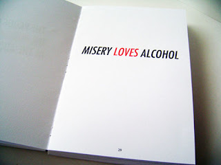
Although here the message is not remotely relevant to the project, the simplistically and hard hitting style of the message is, when promoting or influencing people, it is important, to be straight to the point, and this publication, does this effectively. If i was to do something similar in my project, it would also help to involve statistics, hard hitting message also allow you to be less specific with a target audience and get your message across to more people
The reason for me adding this publication, is i was immediately attracted to the, simplicity in layout of the type. Especially the align from the left, with the bolder titles and first paragraph. The colour scheme is also attractive and has cemented the importance of how important the phone box red, or lack there off, will be in the development of my project.
The reason for me choosing these publications, is the slight swiss modernist influence, something that i have always liked. Simplicity and good stock is something, that when it comes to print is underrated.
This is a prime example of clean, and concise graphic publication, the text layout and spacing, are strong, and allow an easily reader end product. although there is little on each page, it makes the most out of making a impact on the reader, which is what attracted me to it.


No comments:
Post a Comment