Monday 26 September 2011

Design For Print- Task 1

For this section of the task i am going to be looking at information and way finding,  i want to try and link it back to the phone box, or again national identity of britain. Simplicity in message is crucial in this section of the task. 


This is a quick example of a publication demonstrating colour wheel, demonstrating information, in a clear concise way, with a strong layout. 


The thing that attracted me to this piece of design, was the multi usage of letter's and numbers, simplistic graphs allow easily understandable information to be supplied to the on looker. What i would want to achieve, is hard hitting information that will supply my point clearly.


This is an example of showing information in an interesting, taking a more physical approach will allow people to interact more with the design, and as result be more likely to intake the message. it is something that maybe difficult to do for my particular project. 
* projecting phone boxes- 31,000 less. 


This again is a strong example of portraying a simplistic message in an innovative way, that will allow people to interact with the message more, which is obviously important in this case. 


This is a more complex family tree of dinosaurs, although i would not attempt to do anything like this for my project, the efficient colour code, allows you to find things quickly,, something that is important in complexity, if not colour then some other way of narrowing the search. The image itself although complex is interesting to look at. 


Design For Print- Task 1

For this post i will be looking publishing and editorial work that could manifest itself into my project, so looking at things with strong identities and perhaps Britishness. Since starting this task, i have felt that "retro" is something that could find its way into my final outcomes or development, so i will also be looking out for this.


This book as well as having a common theme of phone boxes, i particularly like, due to its interesting page layout, with a red box literally covering photos on each pages, allowing the reader to be more interactive with the book. The book itself can be enjoyed my any nationality due to its wordlessness, but to anyone there will be that resemblance with the UK due to the red box, or phone box. which i believe portrays a certain message, with out needing to be of a certain nationality, which suggest effective design. 


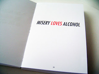
Although here the message is not remotely relevant to the project, the simplistically and hard hitting style of the message is, when promoting or influencing people, it is important, to be straight to the point, and this publication, does this effectively. If i was to do something similar in my project, it would also help to involve statistics, hard hitting message also allow you to be less specific with a target audience and get your message across to more people 


The reason for me adding this publication, is i was immediately attracted to the, simplicity in layout of the type.  Especially the align from the left,  with the bolder titles and first paragraph. The colour scheme is also attractive and has cemented the importance of how important the phone box red, or lack there off, will be in the development of my project. 


The reason for me choosing these publications, is the slight swiss modernist influence, something that i have always liked. Simplicity and good stock is something, that when it comes to print is underrated. 


This is a prime example of clean, and concise graphic publication, the text layout and spacing, are strong, and allow an easily reader end product. although there is little on each page, it makes the most out of making a impact on the reader, which is what attracted me to it. 


Design For Print- Task 1

In this post i will be looking closely at the packaging an promotion of the london phone box, and what it represents, in terms of its britishness and how it has influenced other aspects of graphic design.


The two images above are prime examples of the recognisable and distinctive, nature of what i am going to call the "london red" the bus and the phone box signify london, and UK as a whole to foreign visitors. When seeing the packaging for these book holders, who have been designed by a london designer, there is the automatic connection made. Something that through out the project, needs to happen. 


This is an example of the universality of the red phone box, this is an american piece of packaging, which cements the fact that red phone box is quintessentially British, from a design point of view, its not particularly attractive, but what it says about the phone box is important. 


Although this idea, has been used to promote every city across the world, it could be used to promote the advances of the phone box. Or take influence from its simplicity, as the red phone box is london. 


This is another example of the phone box being a national icon, as far as target it audiences go, its apparent that a lot who bought this would be tourists. In my promotion of saving the phone box, i will need focus more directly on the British nationals and encourage them. 


This although part of a dr. who quote, has interesting connotations when applying it to my projects,  the angels have the phone box can be re worded, but still allow, the message to be portrayed while keeping the dr. who reference, which will appeal to many people. 


Alan fletcher is a British designer, who created some of the most iconic identities in the 60's, his simplisitic style, like the two images above, creates a retro identity that is something that the phone box represent, so his style of promotion could be put forward into my work. 


Design For Print- Task 1

I am continuing to look at branding and identity of this task, however i am going to look slightly broader, as my chosen topic is so specific. And make reference back to graphic design.


As explain in an esrlyer post, the identity of the phone box has alot to do with the type face used, Golden Book is the nearest Typeface,  its an art deco roman typeface, and it bold is largely identical to the original typeface used on the phone box. 


as the project develops the typeface will become increasingly important. 

The Phone box itself creates its own brand, that is the brand of britain, here are a few examples that represent this brand, and the brand that is important i portray in this project.  


GFSmith are a souly british independent, paper manufacturing company. This mail shot embodies everything, independent and British that the phone box also represents, bold, straight to the point. The colour palette is of course representative of this, along with the strong bold typeface. 


This again has little connection to the phone box itself, however as a logo, it includes many of the icons and cultures. This is based around encouraging people to set up there business in london. It is this kind of positive persuasive message that will be important in my project. 


Design For Print- Task 1

Here i am going to be looking at the branding and identity of phone boxes, as well as phone boxes, i will be looking at how obsolete technologies which was the starting point of my 'what is good project' were also packaged as well as all things british. 

The identity of the phone box has changed dramatically over time: 

The K1 


The K1 kiosk of 1920 was the first attempt at a standard kiosk and was introduced by the Post Office, the company then responsible for the fledgling telephone network. Designed by Somerville & Company, and initially produced for the sum of £35, a first batch of fifty kiosks were produced. Constructed of pre-cast concrete with a wooden door, the K1 featured a pyramidal form roof topped with a finial
This unlike any of the other phone boxes had a more defined identity, with a pointed roof and the colour palette including white, which changed dramatically. 

The K2 


The K2 design originated in a Post Office competition in 1924, requiring designers to come up with plans for a new standard kiosk to succeed the various designs proliferating across the country. Previously kiosk design had been determined by the individual telephone companies. Following the consolidation of the majority of telephone companies in to the Post Office a national kiosk design was sought. The winning design, which arrived on the streets of Britain in 1926, was a design by Sir Giles Gilbert Scott, the architect responsible for Liverpool's Anglican Cathedral. Its obvious by looking at this design, that there was a sharp change in the direction in style of the box, and is a more like the present day ones, the colour has been changed to all red. And the Royal crest has been added, which gives the phone box its identity, up until the present day. 

The K3


The K3 was born in 1927 and was a variation on Scott's original design, by Scott himself. Although a successful design, two issues counted against the K2: it's cost and it's size. It was too expensive to produce and transport outside London and had a large footprint. The K3 was specifically designed to be a cheaper kiosk, but it also maintained the design flair of the K2 in a simplified form. Instead of being manufactured out of cast-iron, the K3 was constructed out of pre-cast concrete. This is an example of the K3 these are very rare phone boxes, and although this one has white on it, it was the only one, the only one remaining k3 phone boxes has been kept in london zoo, the identity/style has changed to slightly elongated k2. 

The K4 


This was the first phone box with multi use, stamps could be bought and letters posted at this phone box, this again is very rare. The post office was responsible for this. The type used has also become larger and more apparent on the signage. 

The K5 

The K5 used an improved concrete moulding of the K3 design which was more suitable for volume production. However, this was superseded by the K6 before manufacture began

The K6 


The K6 is the most common and last mass produced red phone box, the typeface used on the phone gives it there identity, is avery recognisable type face, due to the phone box. along with the the royal crest the changed over time. 


The Royal Crest 


this gives the phone box its identity and belonging, up until there present day,  when phone boxes are being sold on and scrapped. It symbolises britain, and in tern, gives the phone box its british identity. 

Design For Print- Task 1

***For this task i have been asked to look for at my chosen concept for the what is good project, and from this find 5 pieces of design context, on:


  • Branding and Identity
  • Packaging and Promotion
  • Publishing & Editorial
  • Information & Wayfinding

Due to the slight obscurity in my chosen topic of phone boxes, and specifically the 'national treasure' that is the red london one, i have broadened my search to focus on certain sub categories:

  • Recycling old technology 
  • obsolete technology 
  • packaging or logo - or the crown 
  • Britishness etc