Wednesday, 25 May 2011

What is graphic design- Type And Image.

For this section of what is graphic design, we have been asked to consider three questions when analysing a piece of work these are:

What is graphic design for?- what function does it perform or what problem is ti trying to solve.
Who is graphic design for?- who is the potential audience or audiences? who is meant to get it or who isn't?
Where is graphic design found?- where is it meant to be seen?in what situation or at what scale? how is the audience supposed to receive it and are they meant to interact with it


This is very simplistic advert, however the simplicity is very effective in this case. This is successful low budget advertising. Photographically is raw, in terms of it not being set out seen, this shown by the rubble lying around, this adds to the image, in terms of encouraging people to get a new bbq. However some people may suggest that this gives a poor company image. i think it shows ingenuity. 


This is a advert for natural hair products, i think this is a clever way of using the environment. The target audience is obviously women, however the advert is there for all to appreciate, which will leave  a lasting memory in both sex,s which can only improve brand recognition. The cut itself is incredibly visually appealing. 


This is a political billboard, Based on iraq was, posing the question, was the war in iraq down to oil? and an unjust war? it advertising a a news night program on CNN. it provokes on lookers of the billboard, which will intern encourage people to watch the programme. 


This piece is designed to amuse, its an advertisement for a hat company, saying the the only difference between charlie chapman and hitler was the hat. I really like the stock this has been printed on to, adds the advert nicely. This advert will probably be aimed at men.


This piece i have chosen to up load, because of its ascetic quality. i also enjoy the type layout and small pt size which is in conjunction with the colour scheme, which pushes the boundaries of legibility. This is a very come style of poster design, but i like the colour scheme used in this one. 


What attracted me to the piece was the interesting type layout, the post also has hints of modernism, which i like. The grey scaled image also works well with the pinky background. I think this may well be seen in the public eye, however i am not sure if the general public would appreciate this image, as i like it from a design perspective. It advertises a film. 


This piece gives the impression of movement, due to the diamond in the middle, and i think this is a clever use of basic shapes in work, is something that would like to emulate. The stock it is printed on to also adds, to the theme of nature and adventure which runs through the work. it advertising an adventure weekend. 


The psychedelic side to this collection of images is what i like, they are meant to communicate the pain of waking up in the morning, and this aproach i think gives visuals to the confusion of waking up. i like the heavy black on the green. 


These are conceptual pieces based around beethoven's symphonies, i think perhaps the layout of the piece directly above is may favourite. i love the simplicity and sharpness of the final outcome. I think again though these pieces are may only be attractive to people who have knowledge of design. 


These are business cards, i think the idea of not all business card being the same, but a number of them creating an image in a strong one, and it is this concept that attracted me to this piece of design. as well as the design being ascetically pleasing. As a business card, it needs to represent formality and style, which i think is accurately portrayed here, with the colour scheme and layout. 

What is graphic design-Image


For this section of what is graphic design, we have been asked to consider three questions when analysing a piece of work these are:

What is graphic design for?- what function does it perform or what problem is ti trying to solve.
Who is graphic design for?- who is the potential audience or audiences? who is meant to get it or who isn't?
Where is graphic design found?- where is it meant to be seen?in what situation or at what scale? how is the audience supposed to receive it and are they meant to interact with it.


These are looking at purely image based design, this is an exploration into the brand recognition of the Mercedes star symbol. I think an image or logo is successful if it can stand alone with out type, and with people recognising it automatically. The star symbol is a globally recognised symbol of quality, and is seen everyday life. 


This post shows the development of the NBC logo. Over time it has created a successful brand identity that is now globally recognisable thanks to technological advances such as cable TV. Again it requires no type to accompany it. Analysing this particular logo, i think the colours used help to cement the brand identity. It really becomes the colours that you recognised as the identity of the brand, not the swan. 


Here is a trio of images that really shows how strong the nike logo is, it has been altered several times, even broken, and it is still incredibly recognisable. Nike is arguably one of the biggest brands in the world, and is used by the most amateur to most professional of athletes. It links the common every day sportsman with the highest professional, and its this reason that makes it such a strong logo. regardless of colour and style it will always work to portray a professional identity. 


This is a head line from the guardian newspaper, which has been graphically reproduced, the headline reads ' beer sales plunge britons stay home' i think this is easily legible from the images. From the an audience perspective, you will have to have some intelligence to interpret this collection of images. often images as a collection help on lookers to interpret better. 


this a piece by Noma bar. who specialises in simplistic drawings, with as little pencil stokes as possible, this image represents the film pulp fiction with samuel l jackson and john travolter. Its incredable such likeness can be shown with such a small amout of marks on the page. it would be easily reognisable for any on looker. 


This is a more political piece by the same designer, who started life as a typographer. its a political message about gun crime, and street crime at night. It again is incedably simplisitic and it is this that attracts me to message is portrays. the style of illustration. the blood from the gone suggest a more sinister message behind the piece. 


This piece again plays on the global brand image of the nike brand. The style of illustration is visually appealing, using a propaganda style to encourage people to buy the product. The colours used attract people to the posters.  i could image a whole advertising campaign based around this style. 


This is part of a lego advert, i think its a strong advert as it plays on the idea of kids being able to make up anything from lego, no matter how imaginative it may be. 


For the last two images of this post, i have chosen two adverts based at promoting greener living. These are clever adverts that are visually and conceptually appealing. I think however the wind farm one is much more successful in getting across its point, especially with the green back ground. It informs people, especially home owners of how important it is to be green, this is done, by using the plugs, as the first thing i though of when i sore the plugs, was applying the scenario into the home. Its more of a mind jogger. i would imagine seeing these adverts on billboards, or even on the internet. 


Tuesday, 24 May 2011

Speaking from Experience-Influences


Here is a collection of interesting book covers, the thing that attracted me to these covers, were the simplicity of a lot of them especially the far right two. i think as images they are very strong. it is this simplicity that i would to look at achieving in my front cover. 


What do i really like about this? not a lot, i shouldn't of bothered up loading this. i guess its a target not to achieve, out of line text and a horrid colour scheme. 


I like the bold illustration style used on this book cover, with out the colour is perhaps this style that i could try and emulate? the centred type is also nice. your eyes are however immediately drawn to the eye. 


This i think is my favourite cover, it pushes the boundaries of legibility, and i like this, i like the way it is kept to two colours, doesn't over complicate the image. 


Another example of a modernist book cover, which i like, simplicity wins the days again.


Controversial topic, portrayed in an unlikely way, the kind of book you would pick up off the shelf due to its cover, and then realise what it is about, and put it down immediately, or continue reading with interest. 


I like this style of cover, basic colour schemes and layout. doesnt over complicate anyting. 


Example of a survival guide, what i dont like about this one is the text. However i like the way in which the illustration looks hand rendered. 


I really like the typeface used on this series of book, i think its important for these find of books to have seriffed typefaces.


example of a formal layout. the page on the left i like the way that the picture takes Centre stage. 


Text heavy, interesting typefaces used, perhaps a combination of typefaces is something worth trying for myself. 


Wednesday, 13 April 2011

What is graphic design.

For this section of what is graphic design, we have been asked to consider three questions when analysing a piece of work these are:

What is graphic design for?- what function does it perform or what problem is ti trying to solve.
Who is graphic design for?- who is the potential audience or audiences? who is meant to get it or who isn't?
Where is graphic design found?- where is it meant to be seen?in what situation or at what scale? how is the audience supposed to receive it and are they meant to interact with it.

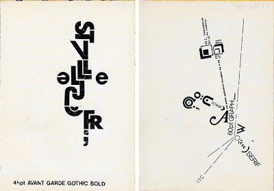
below a few example of type based graphic design.


The pair of images above a by a designer called Lander Janssen, the technique used is letter transfers. What attracted me to this piece was the manner in which the type its self has been laid out, it gives the impression of movement and spontaneity that is very attractive, something typical of the post modern era of design. Its a exploration of certain type faces, using different point sizes etc. These pieces are really informative, pieces which are ecstatically pleasing. when analysing these pieces, its difficult to place a target audience, but what is noticeable, is that you wouldn't have to have a great knowledge of typography to appreciate them, due to the type itself creating an intriguing image. I think these pieces would look at home in a exhibition, defiantly not based on screen. 


This a piece of work, is incredibly simplistic. Its a typographic experiment of new york city, and the poster itself is advertising an event, in which this experiment can be seen. The style of typography used is meant to embody new york as a city, and this is represented in the erratic graffiti like style. Also the use of the statue of liberty image. as a informative poster i appreciate the simplicity and conciseness of the message. target audience would include anyone who has an interest in street art, or art in general.


As packaging the two images above, are for washing powder, a company called michigan salt. I really like the packages as pieces of graphic design. really playing on old, modernist graphic design. with san serif typefaces, bold easily legible and to the point. the use of colour makes the type stand out heavily. As a target audience anyone who needs detergent, however i think this company are trying to be slightly more specialist. The packaging however will have to be interacted with to be opened, this will almost take away from the graphic beauty of the pieces of work. 


You may have seen this on a earlier post on my design context blog. I just think the as a piece of informative graphic design, using shock treatment, its very strong. The shock treatment will always work when the topic is something that plays on personal health. in this instance sexual health. its a clever innovative approach to the problem. thinking outside the box. As typography, it is bold and strong, matching with the message the poster is trying to portray. The audience is anyone who is sexual active and i could pictures hung in a doctors surgery, and people really taking notice. i think it is the use of facts with in the type that makes the message hit home. 


Its my personal opinion that when you use type as image you can often get more out of the meaning of the certain piece of graphic design, i think this is a prime example of this. The type that creates this image reads "Just don't shoot, let the peace be the way" putting the words in the shape of the gun, will catch the attention of any audience. This piece isn't really trying to solve a problem, its really just informing people of the problem, perhaps with gun crime etc. Where is it meant to be see, i think anywhere in the public eye, will allow the message to be put across effectively, perhaps a in areas of high crime. I could imagine it graffitied  on the sides of buildings. 


This is a letter head from Marilyn Monroe production company. Letter heads are something that were incredibly popular, however obviously due to technological advances, letters stopped being sent as much. What i like about the idea of letter heads, as they,in many cases, give the first impression of someone. As a result you could say that the type represents the person or company you receive the letter from. It is the type face that appealed me to this letter head. it makes a bold statement, san serif aggressive typeface, for a letter head. 


This is perhaps my favourite collection of work on Type section of this brief, This is the logo for the contemporary arts fair in santa monica. I would imagine it was used advertisement all over, the area of santa monica. It was defiantly seen by everyone attending the event, as the logo was used, on all tickets etc for the event. I like the way the logo leaves you guessing for a while before you work out how it works in conjunction with the sentence. On the tickets the logo was cropped, it still looks equally as effective, and gives the impression of contemporary art and design. 


Its very common to see over designed wine bottle labels or packaging, with producers trying to plaster there vineyard name and region all over the bottle. These labels would stand out in the supermarket or specialist wine shop for there simplicity. Not over illustrating the bottle, gives the label a fresh approach, they work great as a set. Like all wine it is important to give the image of quality, and this still does. With the ornamental style in which the letters are shown. The stock in which they are printed gives a further indication of quality. along with the gold text. 


These a book covers, i think simplicity on book covers is particularly appealing. The one that to me jumps out is the one entitled "finish" the layout its incredibly simple, and the colour scheme helps attract the any potential readers. The bold typeface, which i think is helvetica bold, sends a strong message, which is appealing. All these covers have a hint of modernist design, lacking in any form of ornamentation, and this is a appealing, simply portraying the message. 


This is a publication from Swiss graphic designer, Rosario Florio. It seems to me like there is a trend in many things that i have uploaded on the blog post. Would i like about this again, is the complete lack of ornamentation, sold san serifed typeface, accentuated by a border, i especially like the way that the spacing has been removed, and replaced by decimal hyphenation. The combination of small text and the larger is also pleasing to the eye. I imagine the purpose of the book is to inform. 


Monday, 11 April 2011

What is a line-initial research

for this project, i have decided to take a deeper look into the boundaries crossed by aircraft and transport as a whole, at the lines that these create with regard to there direction of travel. The way i will develop is difficult to see at the moment, but as a topic it allows be large scope, and offers me a huge amount of research to develop from.