


I put these up as i like the colour scheme, it gives the impression of a retro feel, along with the typeface used. There is almost a chocolate to the feel to the posters, i will look at developing this kind of style when designing a poster for "minty and the after8s"


retro bold feel, portraying a message effectively. Reminds me of the kind of thing you would see in america.
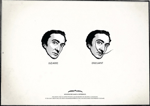

Clever, thought provoking work, that will amuse in tone of voice, this is done in a simplistic fashion.
Nice looking logo here, i like the colour scheme used, and the bold black typeface. The logo flows nicely, and it is not over complicated.

Amusing informational piece of john draper from mad men.
No comments:
Post a Comment