Whilst starting this brief, i need to start by investigating into other museums out there with similar specialisms, this will allow me to create and interesting usp for the typefactory.


This is a very clean identity for the type museum based in london, although they have put a focus on education, you get the sense that there is quite a dull uninspiring ideology behind the museum.. This is why interaction is crucially important in appealing to the young audiences.


This is the strongest concept so far, it puts an importance on education as well as information based material, however when looking through the images of the museum, the displays were dull, and not interactive, however i do like the idea of putting on structured sessions for school trips etc. the identity of this museum is strong, but i think a bit to patronising, to attract design professionals, something that the type factory has to do.

Rit have there own small museum on campus, however it is not promoted in anyway.

The germans seem to have the highest amount typographic museums, what i have noticed about all the identities for a lot of these places, is there far to corporate, and are almost unapproachable. I think embodying a friendliness with in the identity is crucial.


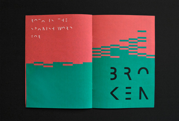
This has a more approachable identity, using just a once colour pallet plus tones.. makes this feel the way it does. I like the heavy type running across the top.


This is a greece based museum, the image in the background makes a more approachable to potential guests.


Dutch based museum far to text heavy on first impression. in terms of competitors for the type factory, there is limited, what i think is very important is focusing on taking typography as a subject matter, and making it accessible and fun for people of all ages, interaction is the key to this museum, and this should be reflected in both my identity and attractions.
Looking at the identity of Musuems and gallery spaces.


This is an entirely simple, yet effect piece of way finding, using this minimalist style, is effective however i need more interaction for the visitors. typographically it needs to be neutral, although i am looking at the concept that all of the way finding maybe be change able, however still legible.
- Print Literature
- Branded Product
- Advertising
- Admissions desk with LED signage
- LED signage
- Signage program
- This is a strong example of how the identity of the museum can be applies well through out the museum itself, to only push forward the strength of the the identity. The typeface works due to its neutrality. the colour scheme is also simple, something that i will defiantly try and emulate in my design.

 Strong type based identity, very industrial in style. Do i need to have imagery in the identity of the museum? perhaps makes it feel more approachable? also could be considered as it will be another thing for interaction.


This has an incredible range to the brief, something that i would ideally be able to emulate, or at least emulate something close to. The identity is on the corporate side, however it is made more approachable with the use of colours. It will be important to consider both print and screen based media. The application of the identity across the range, gives the project a certain credibility.
- The use of the identity across the printed media is strong here, i especially like the way the logo is is overlaid on the the advert for and up and coming exhibition. the use of colour is also nice, something that maybe be difficult to emulate in the the typographic museum, however the usp could also be a mono tone museum.. or different rooms being different colours depending on the period of time each room was set in.. for example. the room about letter press could be black and white.. where as digital screen type could be florescence.The visual identity of this museum is successful due to its limited colour pallet, the tonal pink works well in drawing the eye of the potential visitor. The heavy neutral type again is present. how with the ethos of interaction that has to be applicable in my design, i need to come up with an innovative way of making the visitors interact with every aspect of the identity.


What i like about this project, is the way they have used a typographic layout system to produce the identity of the design, this is something that i can emulate in y own work, to produce the interactive identity.. i want.. working around a grid will allow people to interact a rearrange the identity or way finding.. making them part of the fun of going as well as the information given..


I have narrowed down the the concept for the type factory, the idea behind the concept is all about interaction, the more interaction there is in the museum the more interesting it will be for younger audiences and people who no little about typography which is really the purpose of the brief, to get people into type.. as a result of this.. the theme of the museum, is taking deconstruction to construction.. this will mean all of the signage,identity, exhibits will be deconstructed and people with in the museum will be able to reconstruct everything.. with in the grid format. creating interaction, it will be also interesting to see the way people interacting with wayfinding, something that is normally so set in construction.


examples of deconstruction.


the reversal of the type on to a background works well, and is visually appealing in the monochrome. The iconography is perhaps over detailed, and keeping in mind the deconstructive nature of my brief i will need to look at how i can incorporate this into the way finding itself.


