Monday, 5 December 2011
78RPM - MP3 | 70 Years of Revolutionary Protest Music from Dan Flynn on Vimeo.
What i like about this video is that it changes scenario with the mood of the music, this creates strong visual effect. I think i will look at this video further.. the use of different typefaces suggest the different tone of voices, i also like the angle the type in shit out through out. it fits the rate of the music.
Monday, 28 November 2011


Friday, 11 November 2011
What Is Good Collaboration Ideas.
The basis of the collaboration will need to be something, that plays with something very British.. i.e. olympics 2012.. Twinning tea.. Beer etc.
it needs to be something that would appeal to the masses as i am trying to inform the masses of the issue behind the phone box. I need to work out what i am trying to achieve with in the project as to which target audience i look at?


What Is good- Inspiration
This post is looking at inspiration for publications which will be part of my project, i want the entire project to be limited to a consistent colour scheme which is why i have chosen much of the publications below to put on the blog.


This publication uses prudently black and white, but without colour it doesn't take away from the effectiveness of the outcome.. the use of type is important here in creating an effective final outcome. this is something i could take into my own project.


This is very similar to the idea i am currently working on the voting scratch system.. i like the layout of the type below although it could be over powering to an on looker, the interactive process of popping out the circles.. could be used in my project.


Again a heavily type based book, i think this is the direction that my publication will go in.


using opacity of colour and neutral colours creates an interesting final outcome.. i like the way the colours are used to highlight important areas.. the stick is also appealing and the way in which it is packaged.


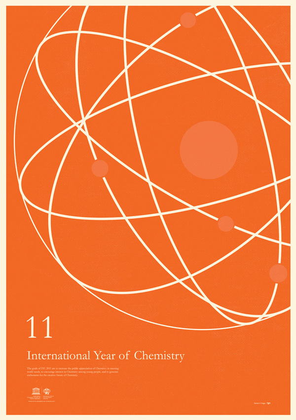
posters, simply visually appealing with just the use of shapes.. something that i always find appealing. perhaps i could uses this kind of style in poster design.
Wednesday, 2 November 2011
Other Inspiration


I put these up as i like the colour scheme, it gives the impression of a retro feel, along with the typeface used. There is almost a chocolate to the feel to the posters, i will look at developing this kind of style when designing a poster for "minty and the after8s"


retro bold feel, portraying a message effectively. Reminds me of the kind of thing you would see in america.
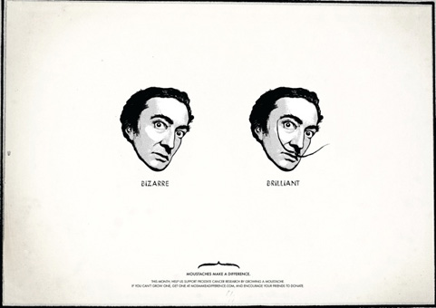

Clever, thought provoking work, that will amuse in tone of voice, this is done in a simplistic fashion.
Nice looking logo here, i like the colour scheme used, and the bold black typeface. The logo flows nicely, and it is not over complicated.

Amusing informational piece of john draper from mad men.
Subscribe to:
Comments (Atom)